CGI for robotics: brand first, technology in the service of history
Robots become relevant when they take on a clear role in familiar spaces. The International Federation of Robotics (IFR) reports that approximately 200,000 professional service robots will be sold in 2024 alone—making it all the more important to develop a visual language that anchors this technology in everyday life. Our project demonstrates how robots can be effectively staged in the home and living sector: We translate brand tonality into spaces, poses, and gestures, and let the robot work rather than just showing it off. The result is a calm, precise visual world that serves marketing goals: highly explanatory in close-ups, desirable in hero shots, and scalable for campaigns. Our page for Smart Home & Tech brands demonstrates how we fundamentally approach this visual language for connected products.
Translating brand language - from style guide to visual language
Every brand has codes: Material DNA, color temperatures, rhythm in surfaces, the ratio of tech to warmth. We transfer these codes into the image: matt white and graphite tones, soft edges, minimalist accessories. The robot follows the same design style in an ergonomically plausible way, without futuristic harshness. The result: brand coherence that is maintained across all motifs.
Product at the center - use cases that get to the heart of the benefits
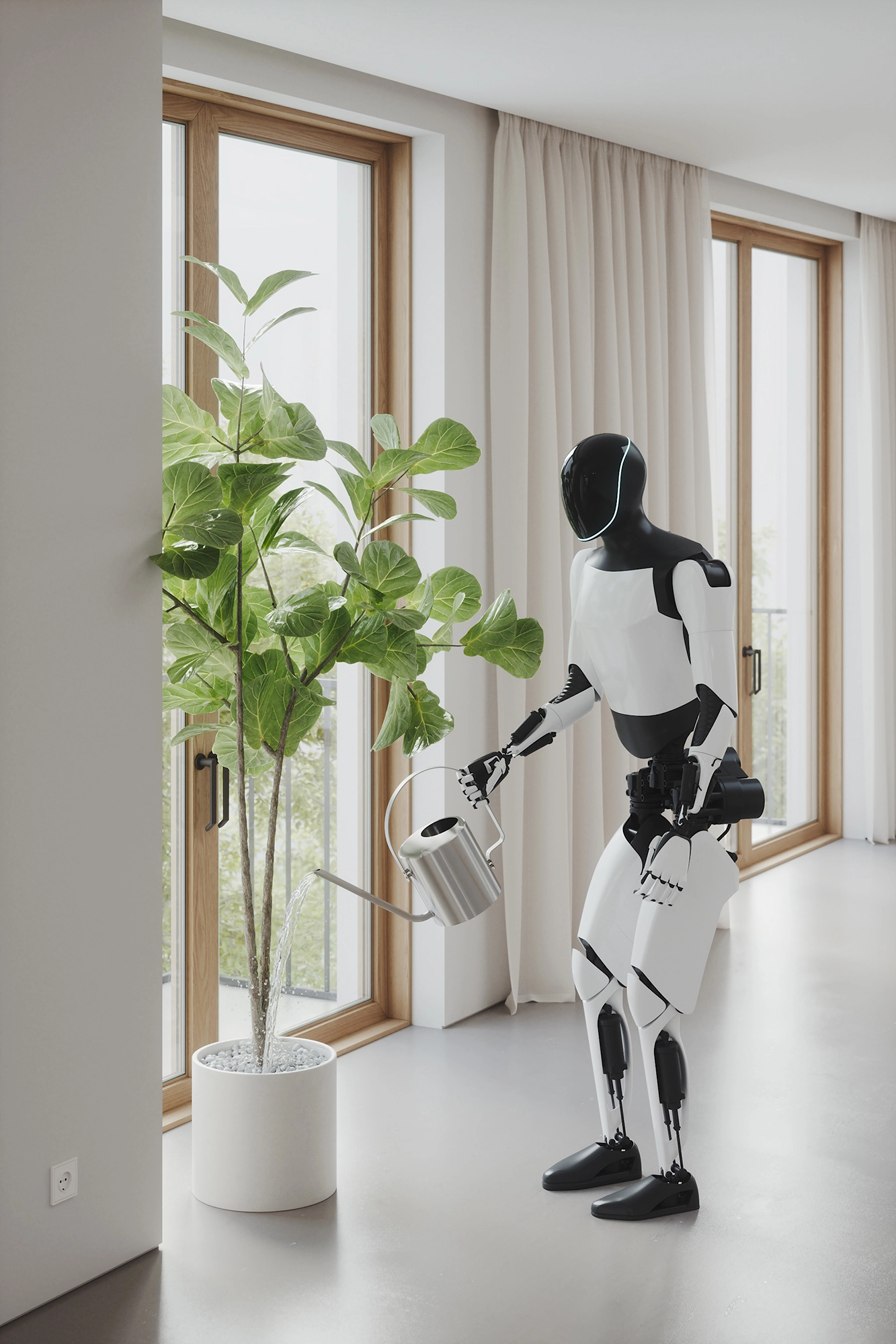
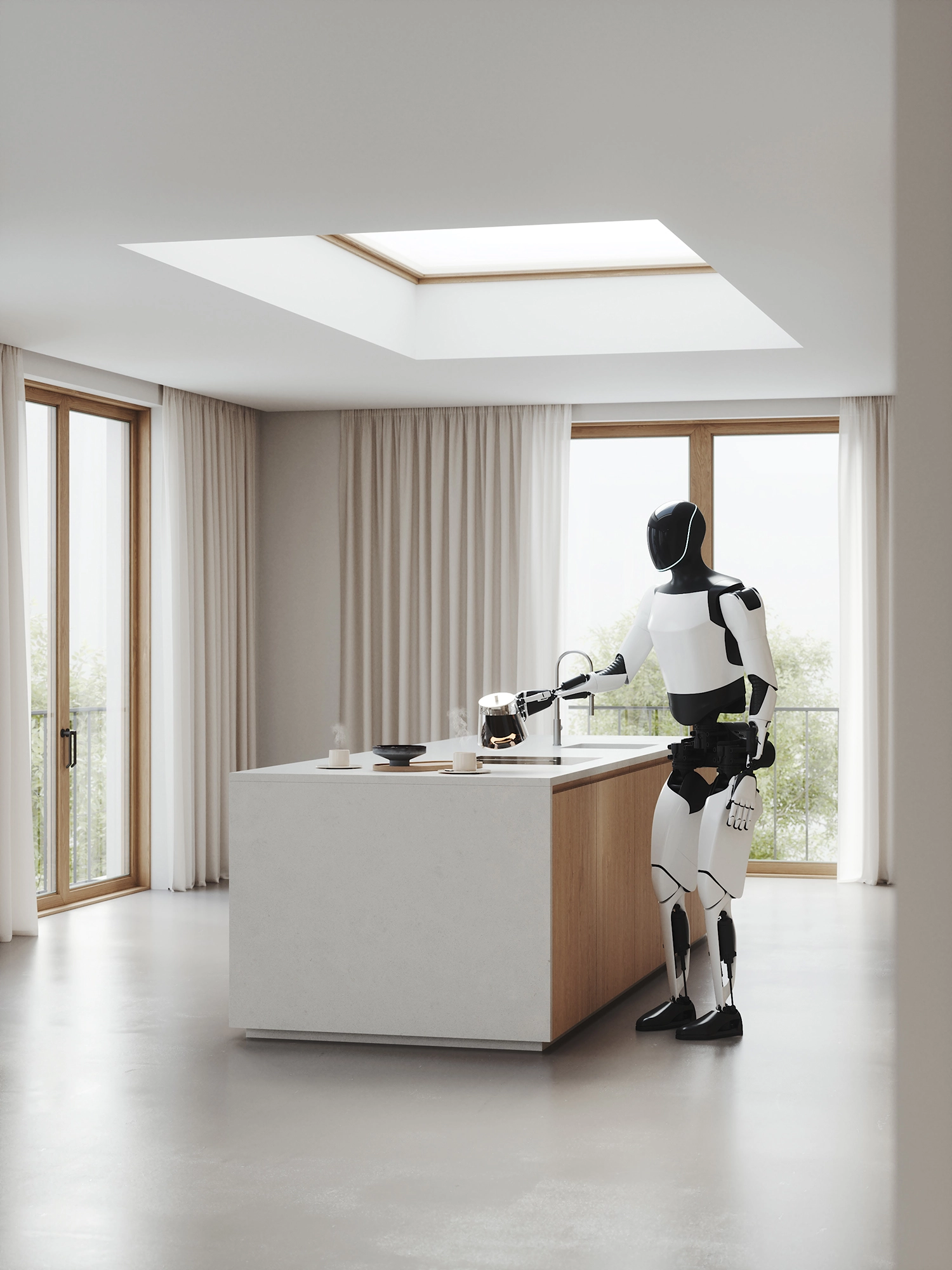
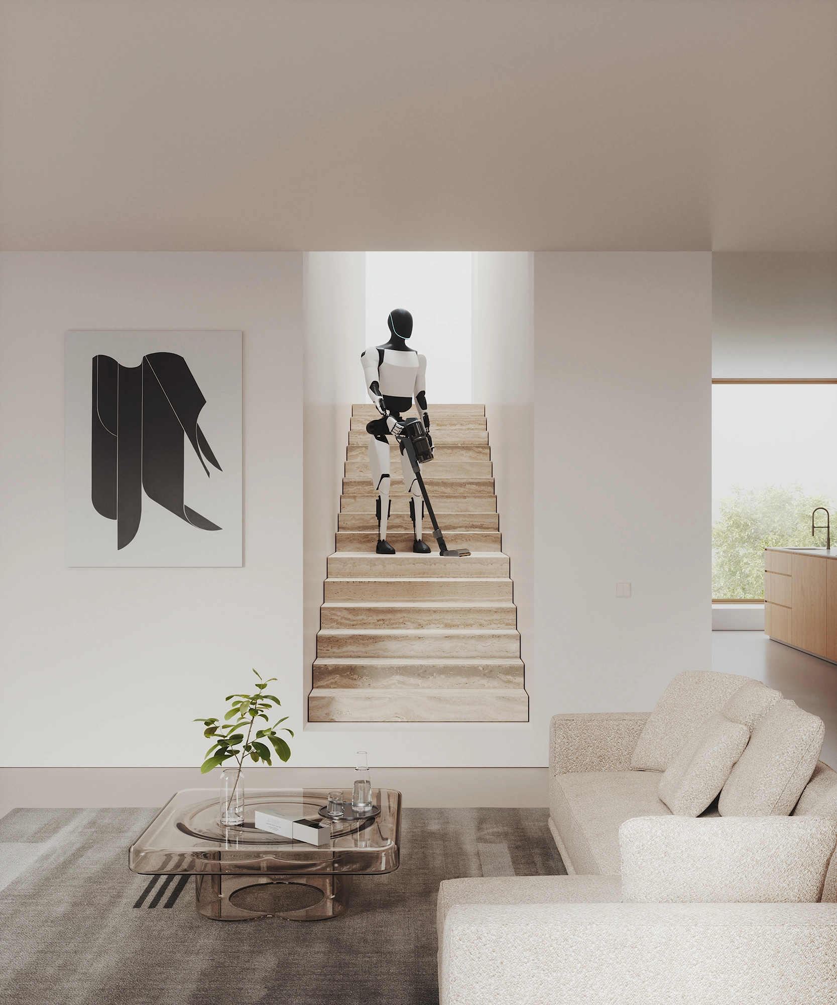
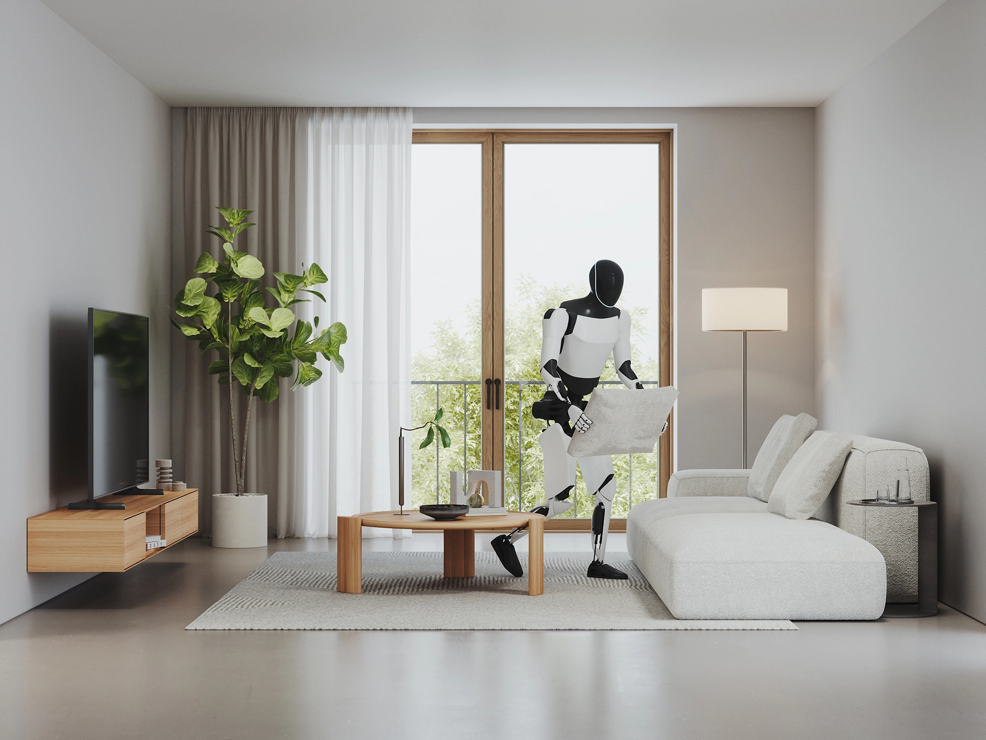
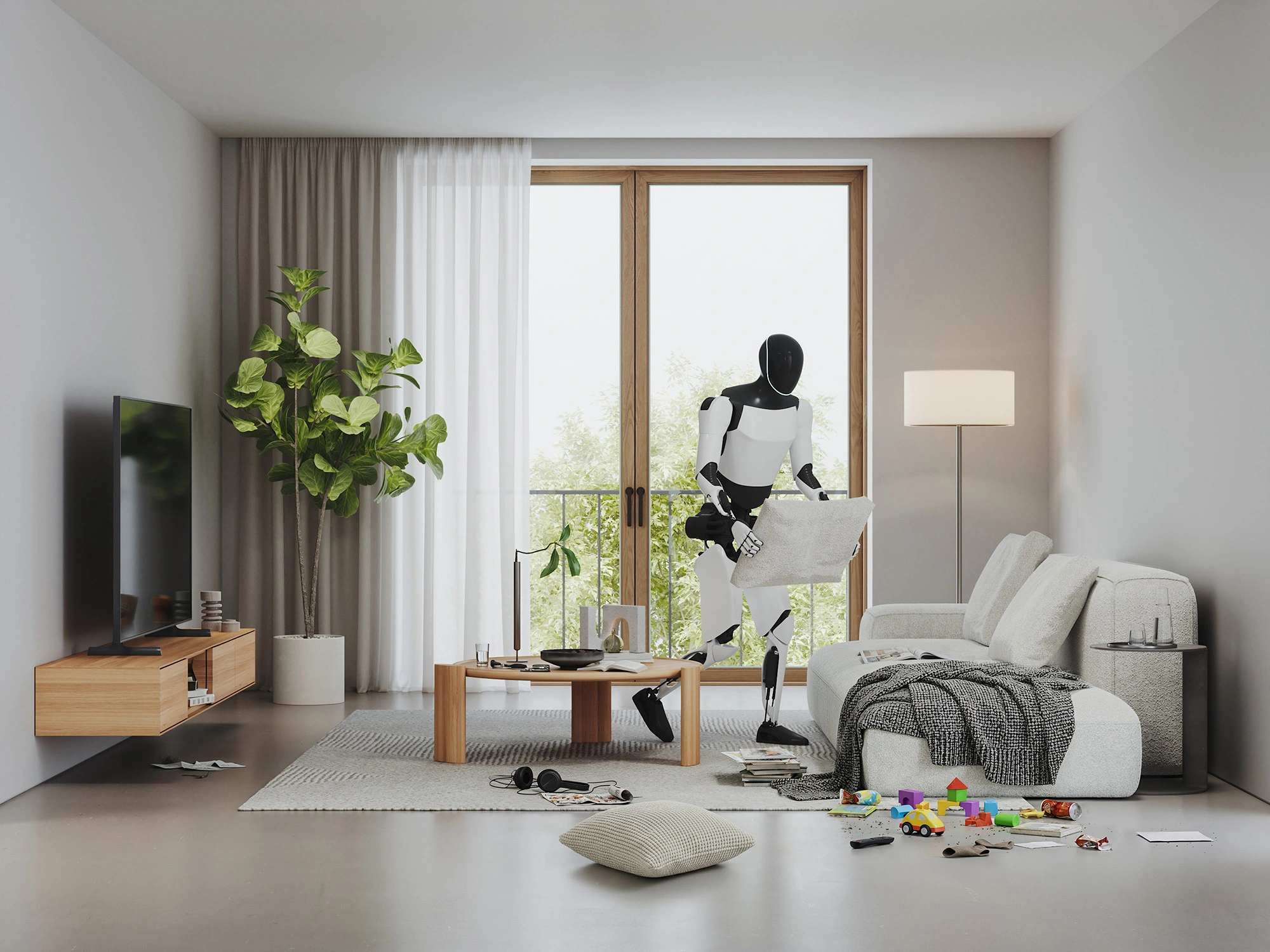
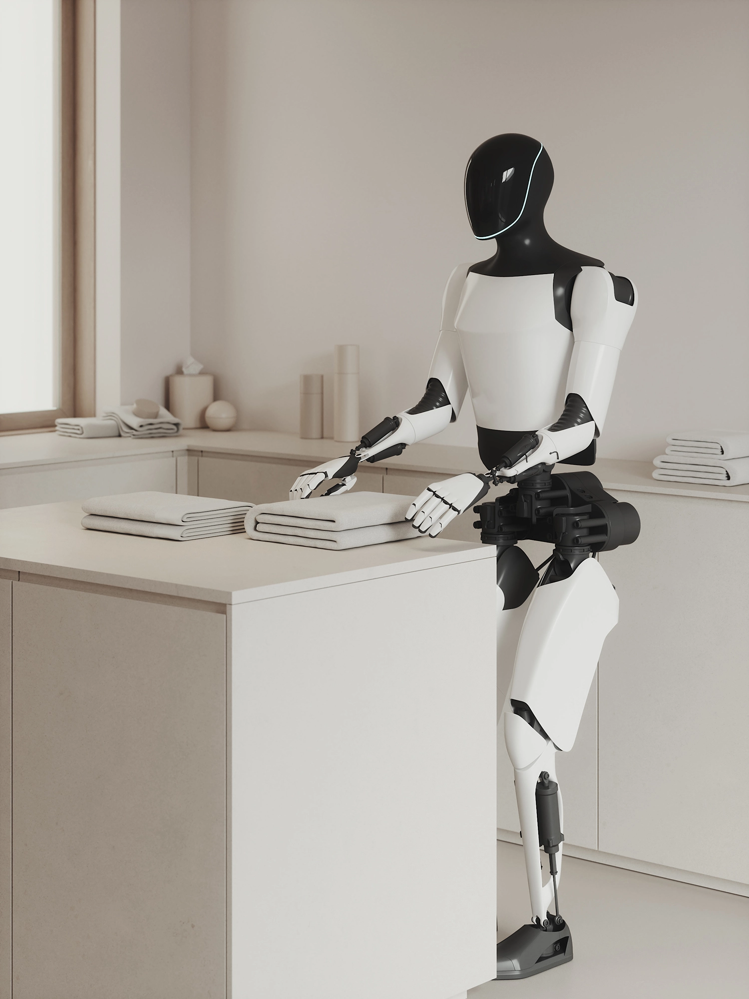
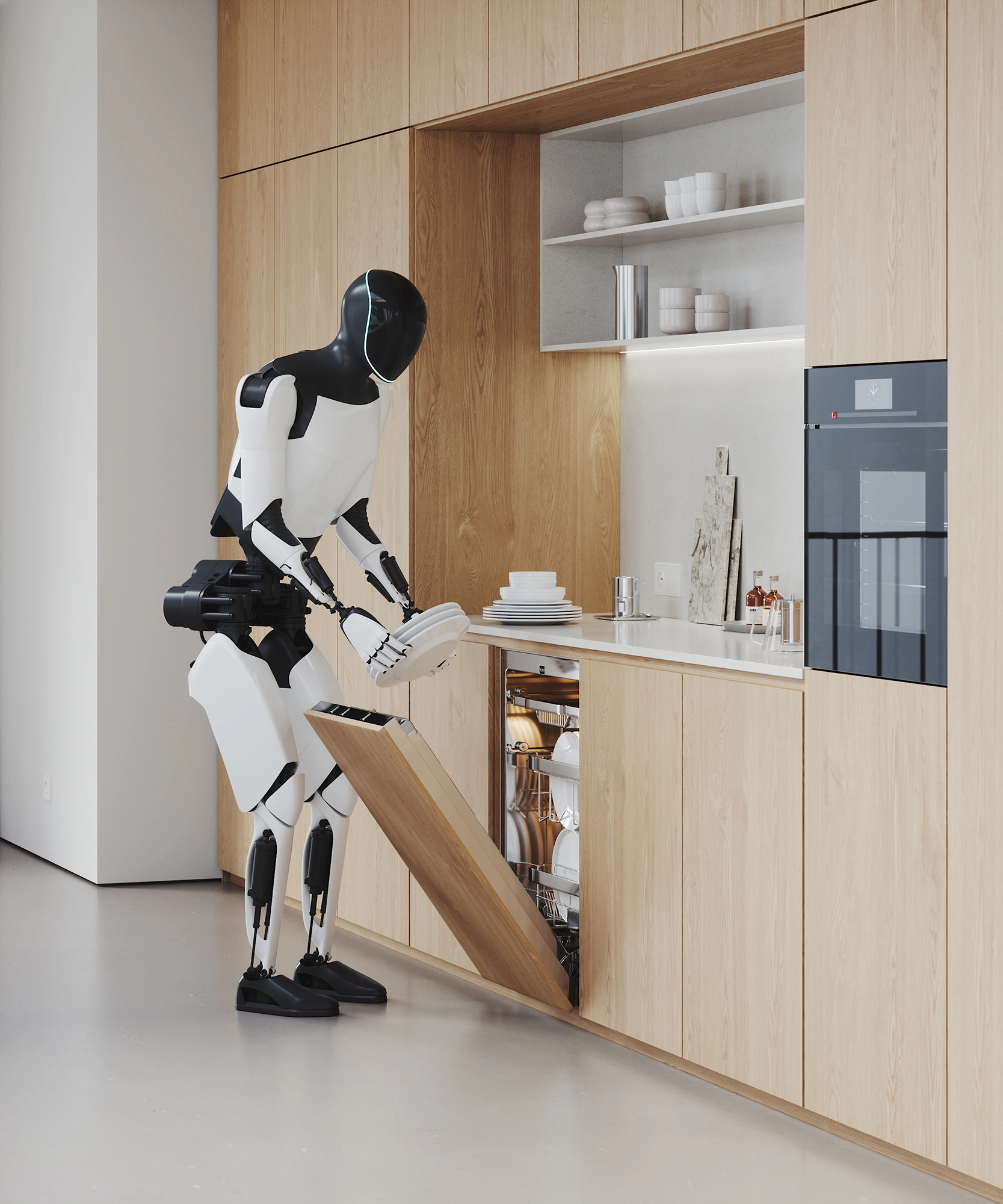
Straightening pillows, pouring coffee, loading the dishwasher, watering plants, vacuuming the stairs: concrete micro-stories instead of abstract heroic poses. What still sounds like science fiction today has long been a reality in research—institutes like the Fraunhofer IPA have been developing assistive robots for precisely these kinds of everyday tasks for years. Each scene answers a marketing question: What can the product do? How does it feel in everyday life? We choreograph moments of interaction, lines of sight, and contact points so that function and value become clear without text.
Curating settings - architecture & spaces that let the brand speak
Interiors are not a backdrop, they are a co-narrator. We choose homely settings with a clear typology: warm wooden kitchens, bright living rooms, quiet circulation areas. Materials (stone, textiles, glass) support the brand contrast: tech meets homeliness. Nothing is overstaged, everything is deliberately placed, from the distance between sofa and coffee table to the step height on the stairs.
Reduced architecture Product and activity in the foreground
Our interior designers have created rooms that are deliberately kept minimalist: clear volumes, calm surfaces, few materials. The architecture is the stage, not the main actor. Spacious wall and floor surfaces in warm off-whites, oiled wooden surfaces and discreet textiles create a neutral tonality on which the product and the action have an effect. The décor is exclusively functional - cup, cushion, watering can, vacuum cleaner - precisely those props that explain the activity. Lines and negative space guide the eye to hand-object contacts; fine micro-contrasts and controlled specular highlights draw material edges. The camera works with moderate focal lengths at eye level and gentle depth of field so that every gesture remains legible.
Light & color - premium without pathos
Natural window light, soft gradients, controlled highlights on metal: the light leads the action, not the effect. In terms of color, we work within narrow tolerances so that the CI palette - whether a cool, matter-of-fact look or a warm brand image - remains consistent in every channel. This look-of-line is the basis for campaign series and retargeting cuts.
Camera work & composition - legible gestures, calm dramaturgy
The camera remains at eye level and seeks clear gripping gestures - never circus, always purpose. Close-ups focus on joints, buttons, hinges; half-length shots anchor the robot in space. This creates a dramaturgy from use to desire: first understanding, then desire. The image structure is deliberately "light" - so that headlines, prices or UI layers in ads dock on smoothly.
A setup becomes a campaign - think channels before rendering
We plan format variations before rendering: 16:9 for product pages, 4:5/1:1 for social media, and 9:16 for Stories. We also create short loop clips (closing a cabinet, pouring coffee), detailed crops for retail tiles, and hero-worthy stills for PR. All assets are color-graded consistently and can be adapted quickly—ideal for pre-launch, retailer information, and always-on content. You can find examples of our spatial approaches in our CGI projects and interior visualizations.