From Fabric to Stage: How the 3D staging for Wittmann’s BELETAGE was created
Wittmann: Comfort as culture
Wittmann stands for furniture that combines precision craftsmanship with calm sovereignty. No posturing, but attitude: soft transitions, honest materials, comfort as a leitmotif. This DNA was the benchmark for our visual language - every detail is aimed at tangible quality.
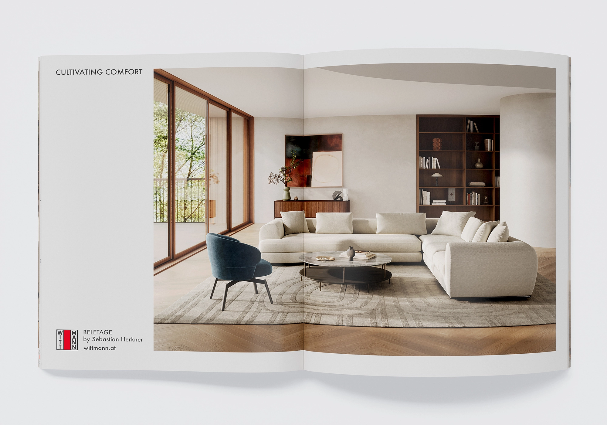
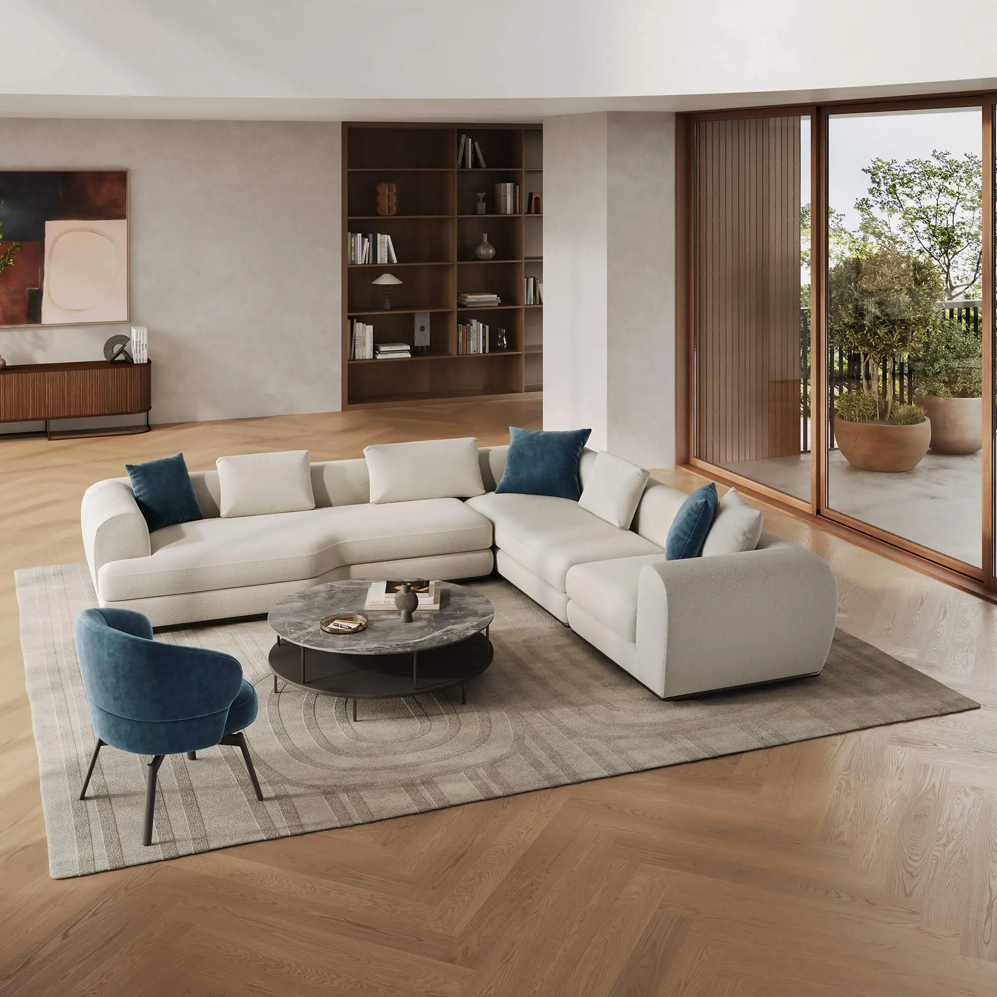
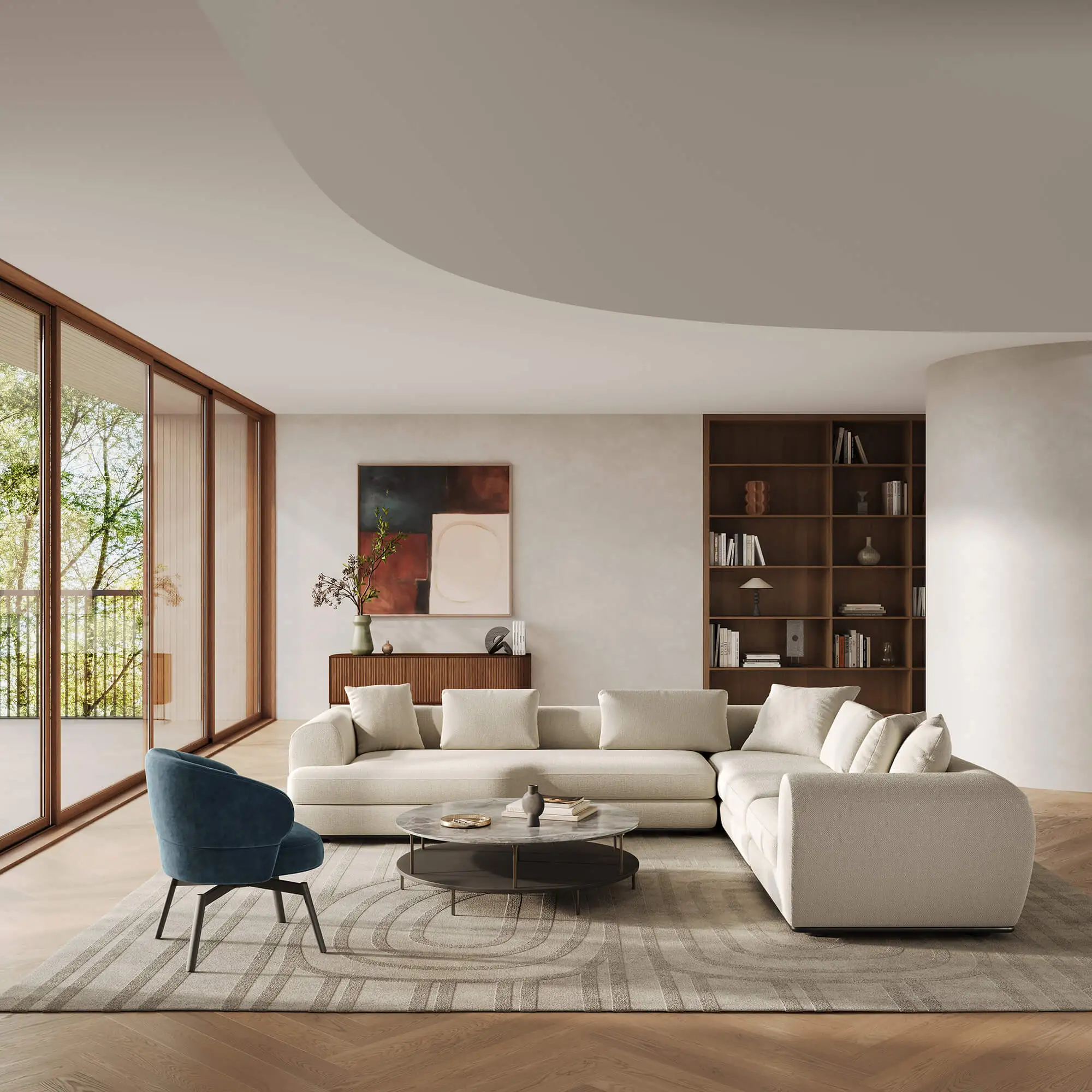
BELETAGE by Sebastian Herkner: Silhouette & System
The idea of the "Beletage" - the preferred, prestigious living area - is translated into the present day: a modular sofa system with balanced proportions, finely placed details and generous dimensions. Curved and clear modules can be combined to create expansive seating landscapes; a seemingly floating metal frame supports the voluminous upholstered elements and characterizes the calm, self-confident silhouette. Designed in 2025 by Sebastian Herkner for Wittmann - more on the BELETAGE product page.
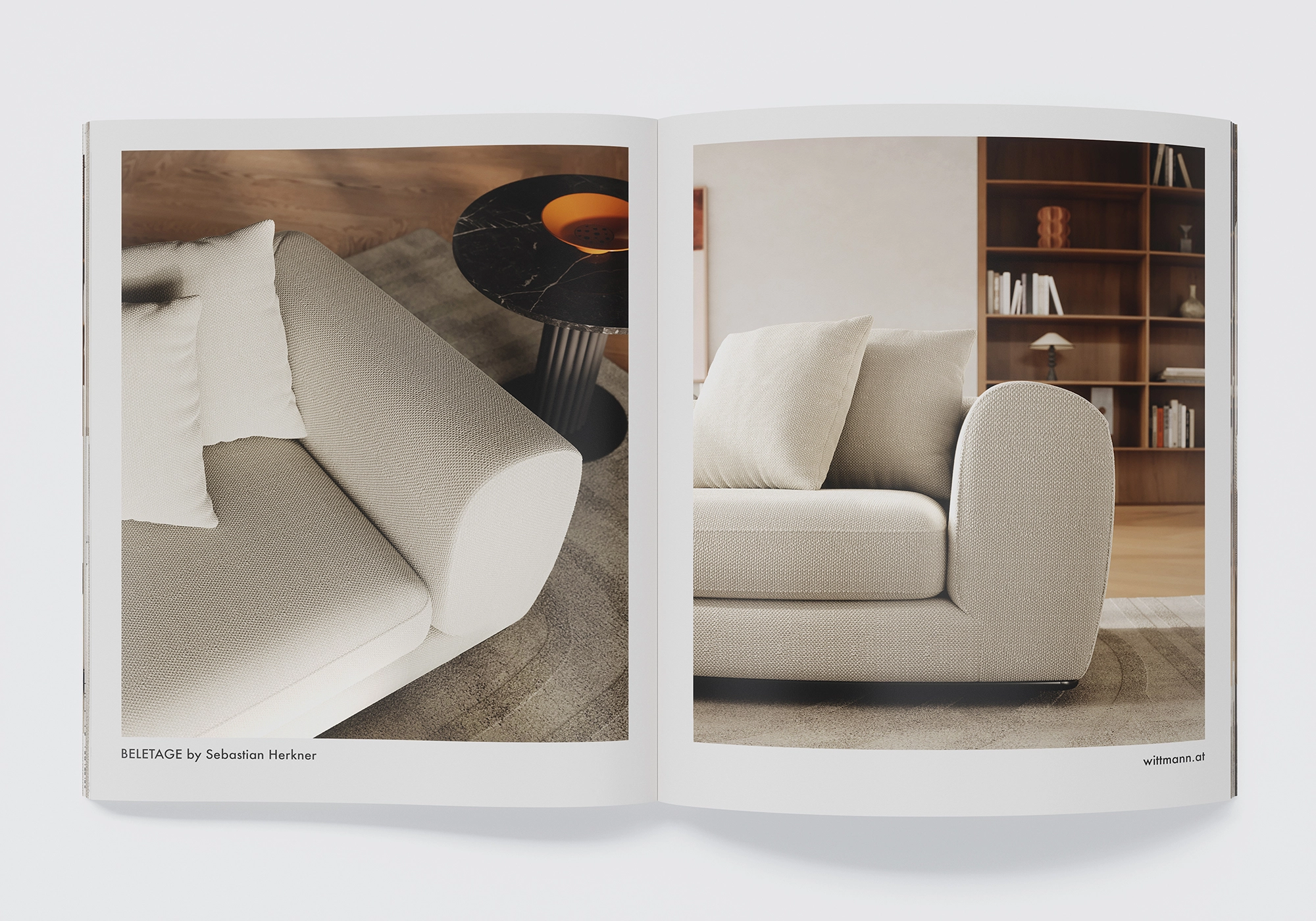
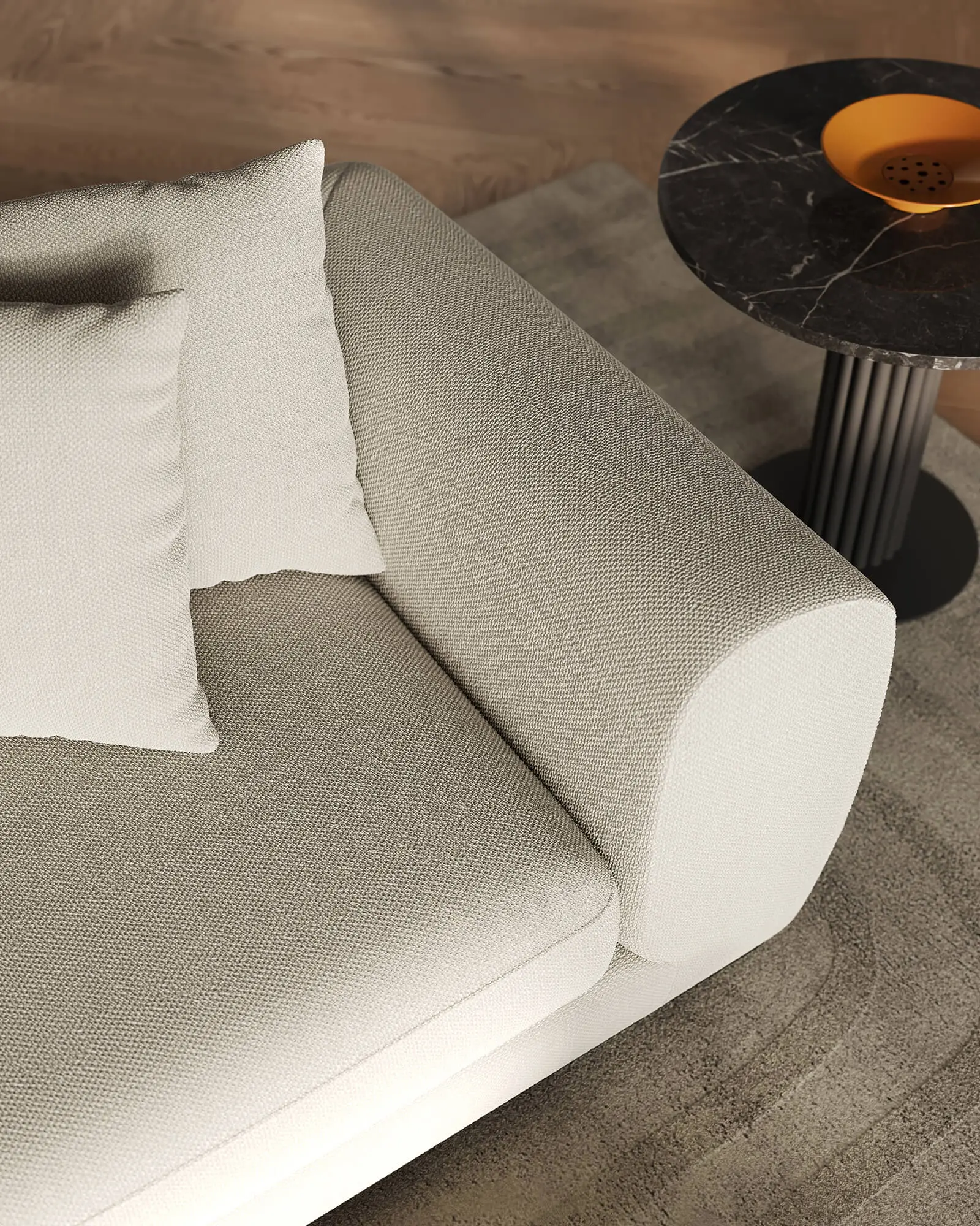
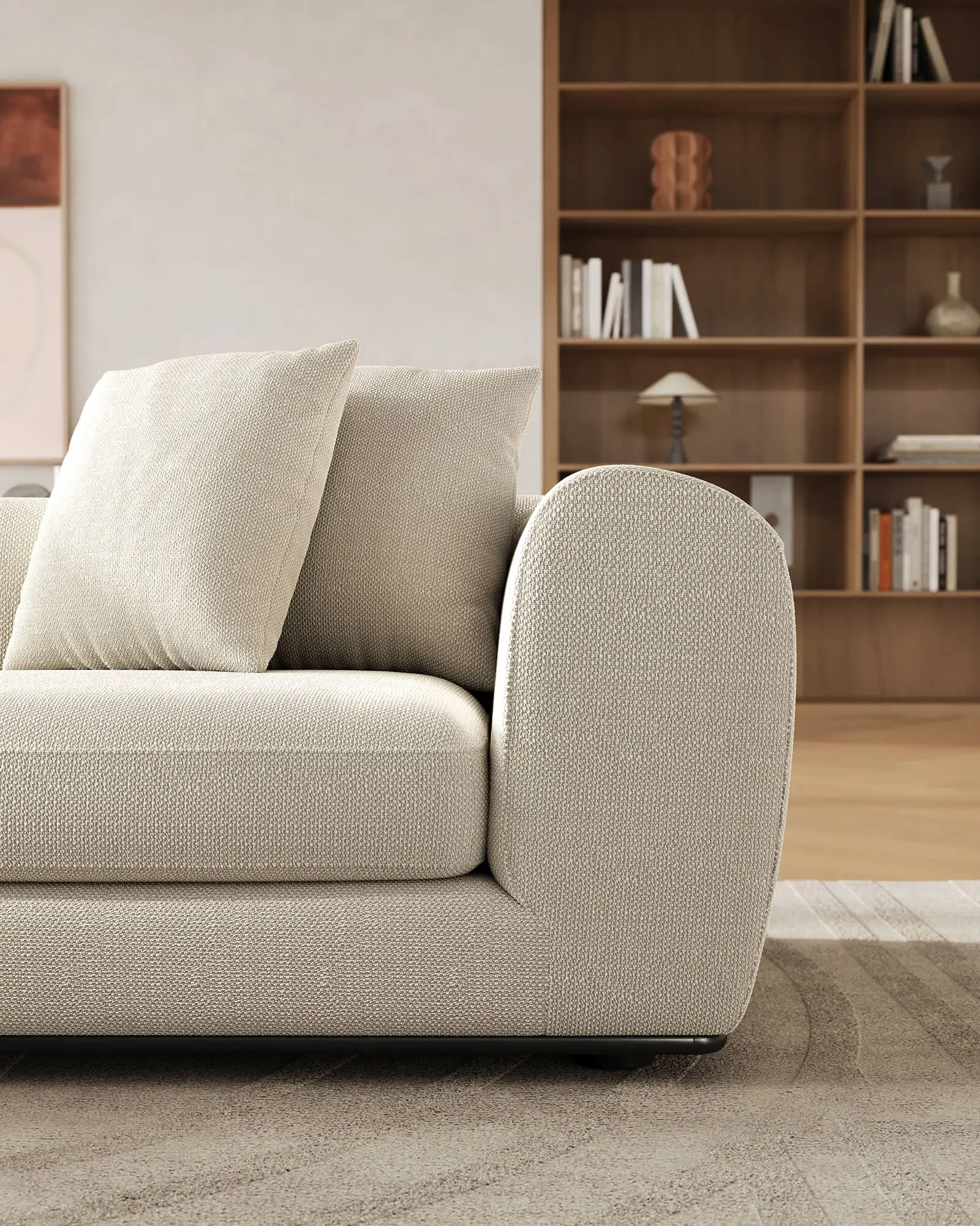
Digital fabric: PBR material from the original fabric
To ensure that BELETAGE also feels "right" digitally, we scanned the original fabric, color-calibrated it and built it up as PBR material - including clean UV mapping, roughness and normal maps. As a result, the fabric reacts to light as it would in real life: fine gloss levels, subtle fiber drawing, credible depth. We show how we prepare materials here: Digitizing surfaces.
High-poly model & shading: precision for close-ups
The sofa was modeled in high-poly: Seam patterns, edge gradients, volume - right down to the subtle compression of the upholstery. The shading follows physical parameters(physically based rendering) so that micro-shadows(ambient occlusion), folds and transitions appear organic. The basis for renderings that also generate confidence in the close-up. More about our approach: 3D modeling.
Brand space from the Miro board: Understated Luxury in the picture
Based on the shared vision, we developed a brand space that doesn’t merely decorate BELETAGE, but makes a statement: deep, rich tones as a haven of calm, warm wood for texture, curated art as accents, and large windows for soft natural light. Two clearly defined visual axes—the iconic facade and the vibrant living space perspective—structure the series and provide inspiration for the product page, social media, and PR. Wittmann also used selected motifs in an advertisement in HOME Magazine (Issue 09/2025) —a nice sign that the visual language also works well in an editorial context. Our approach to spatial staging: interior and spatial visualization.