The Choreography of Two Patterns
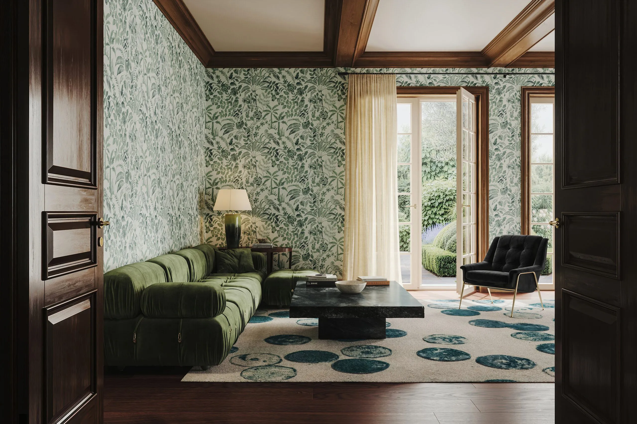
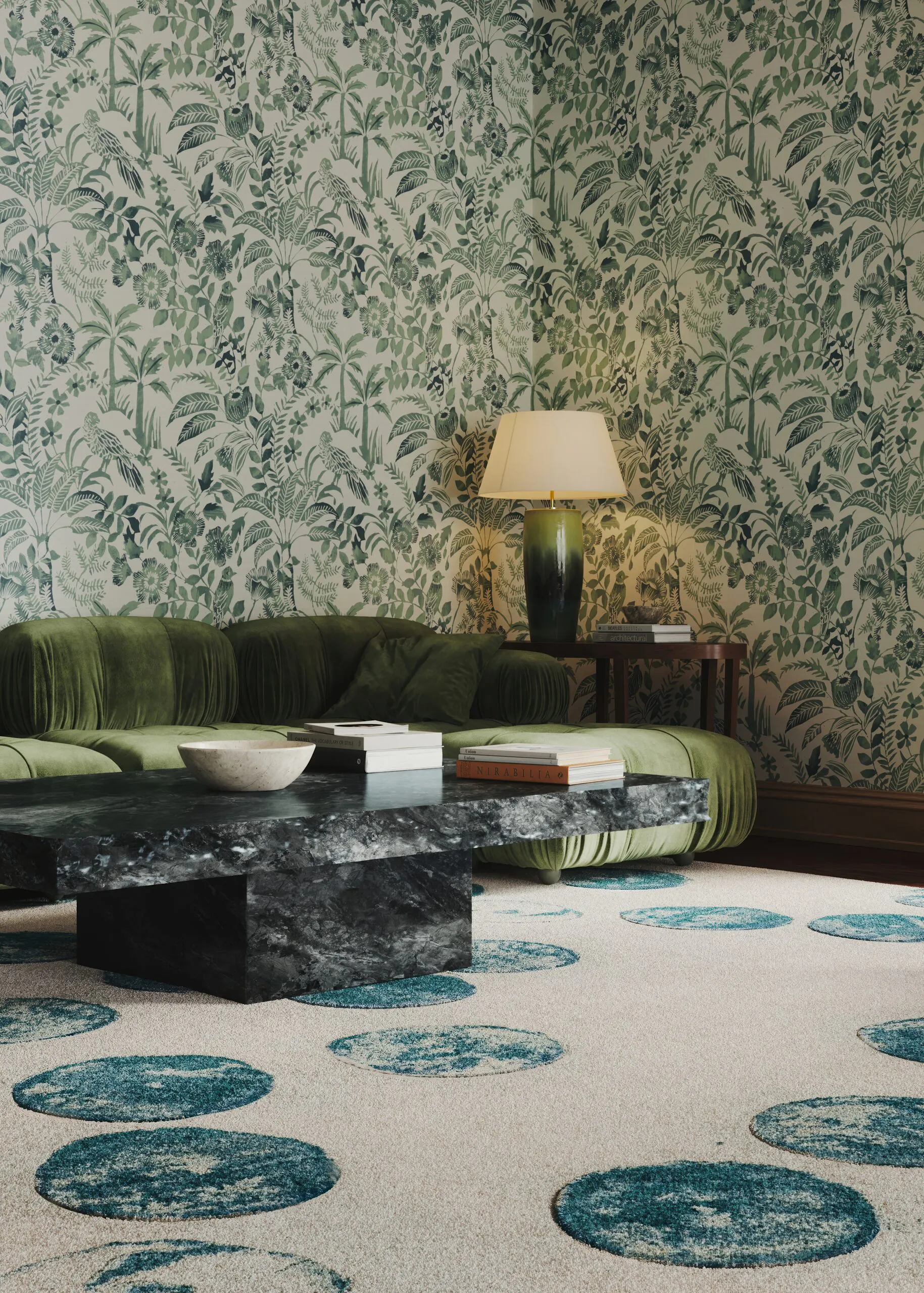
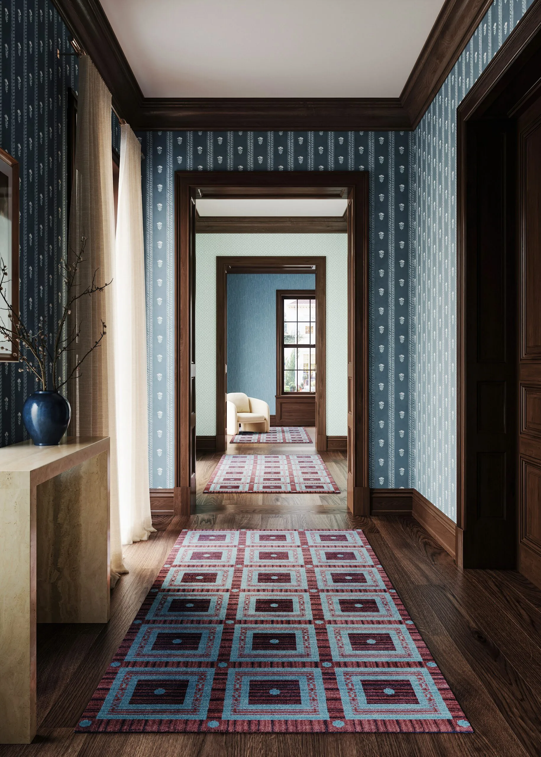
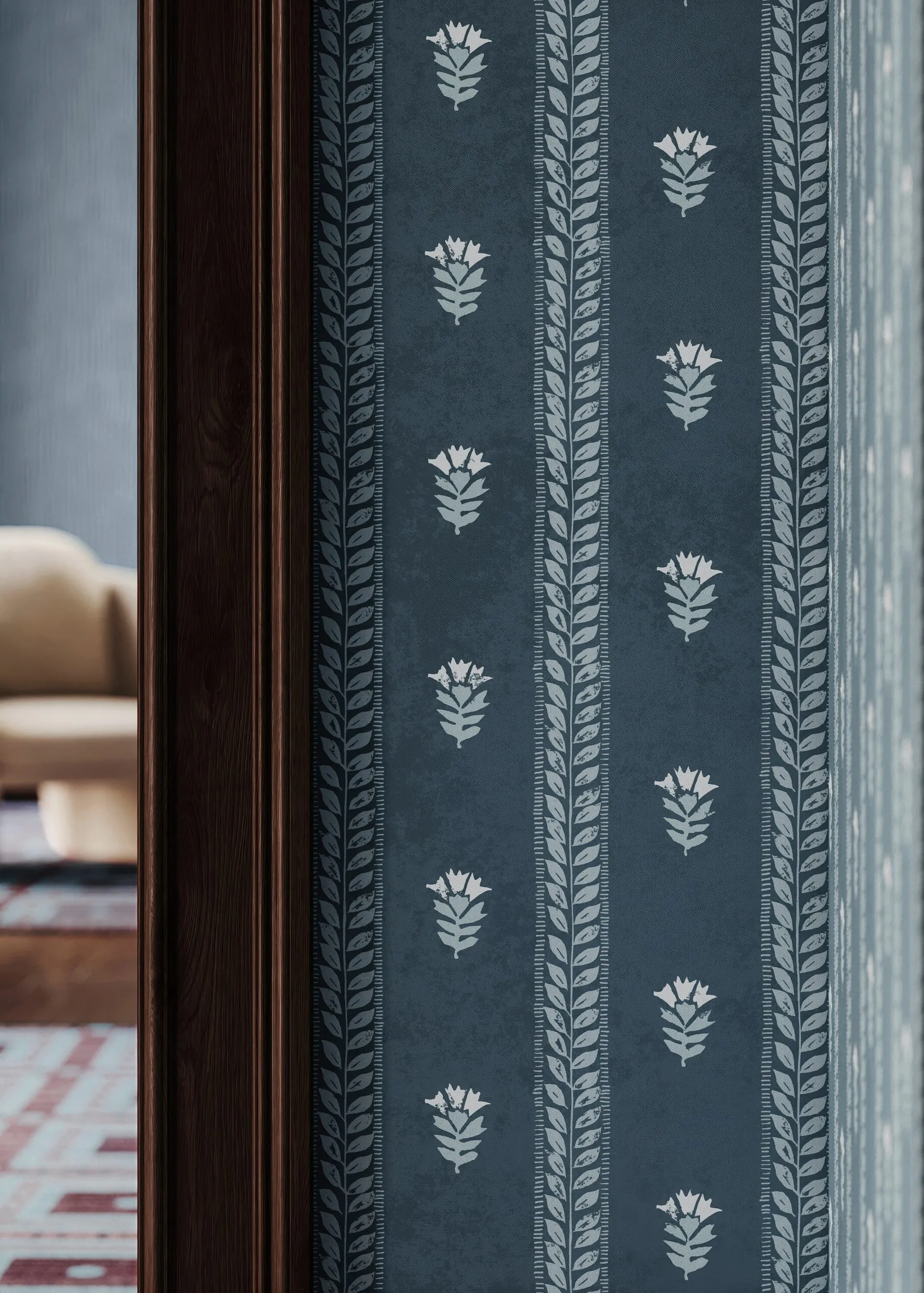
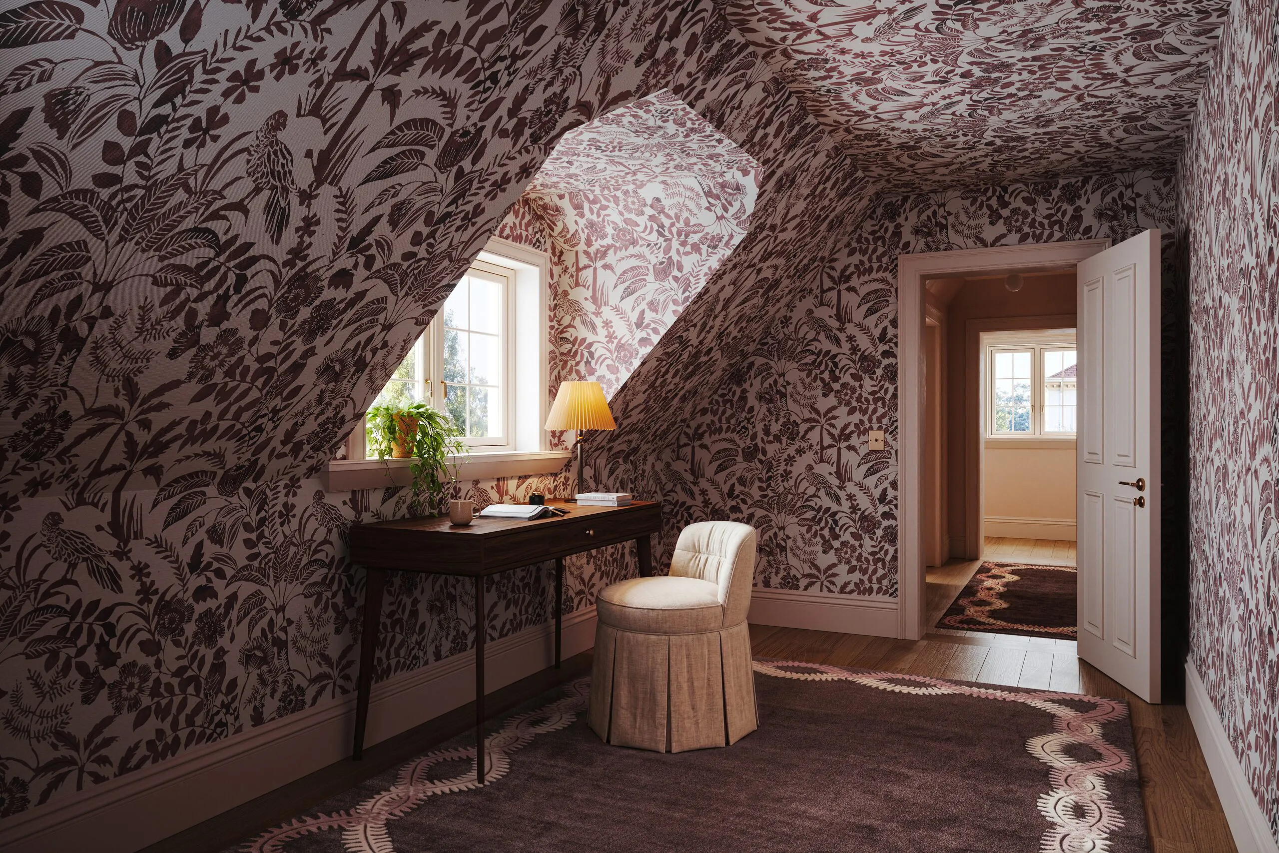
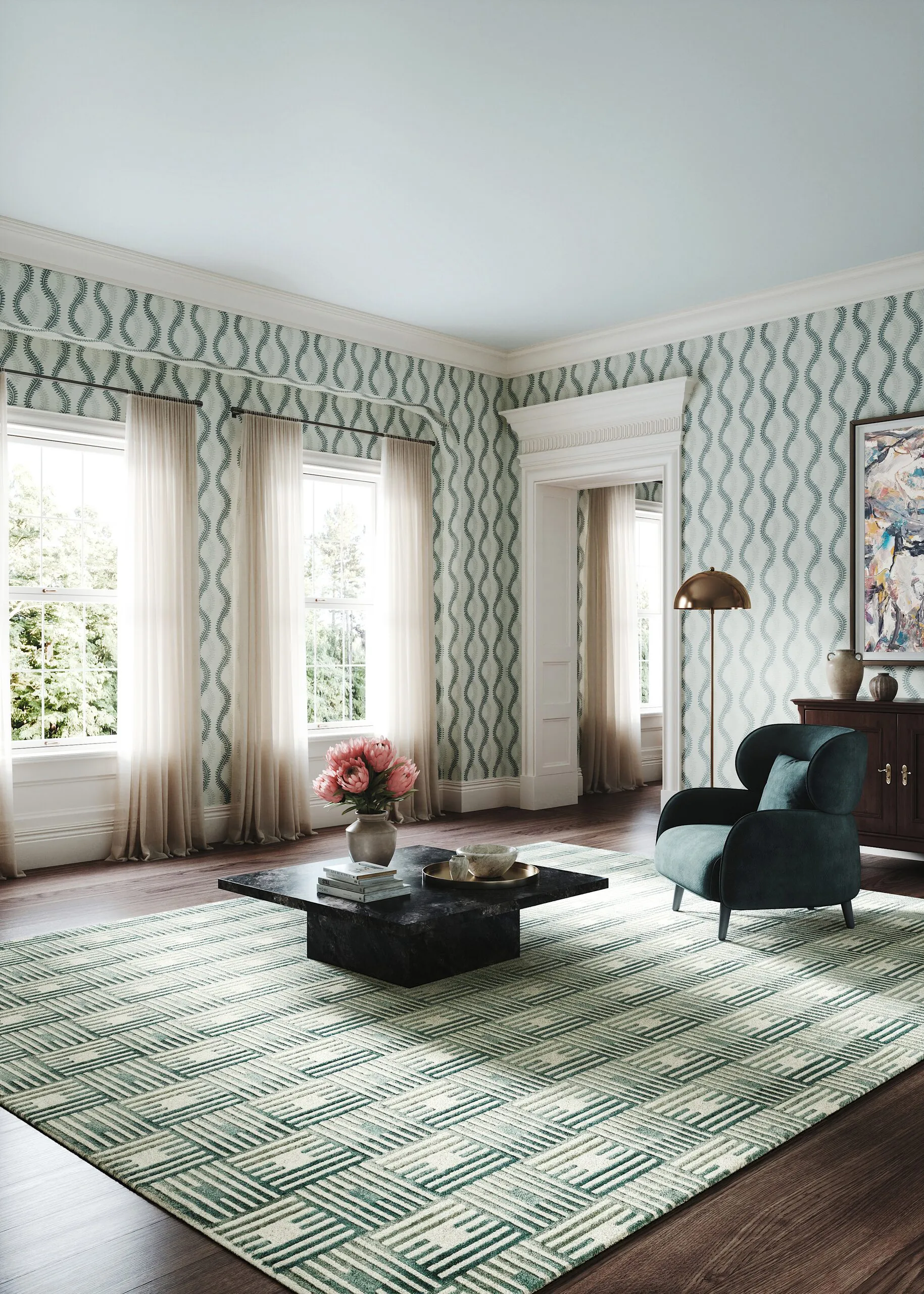
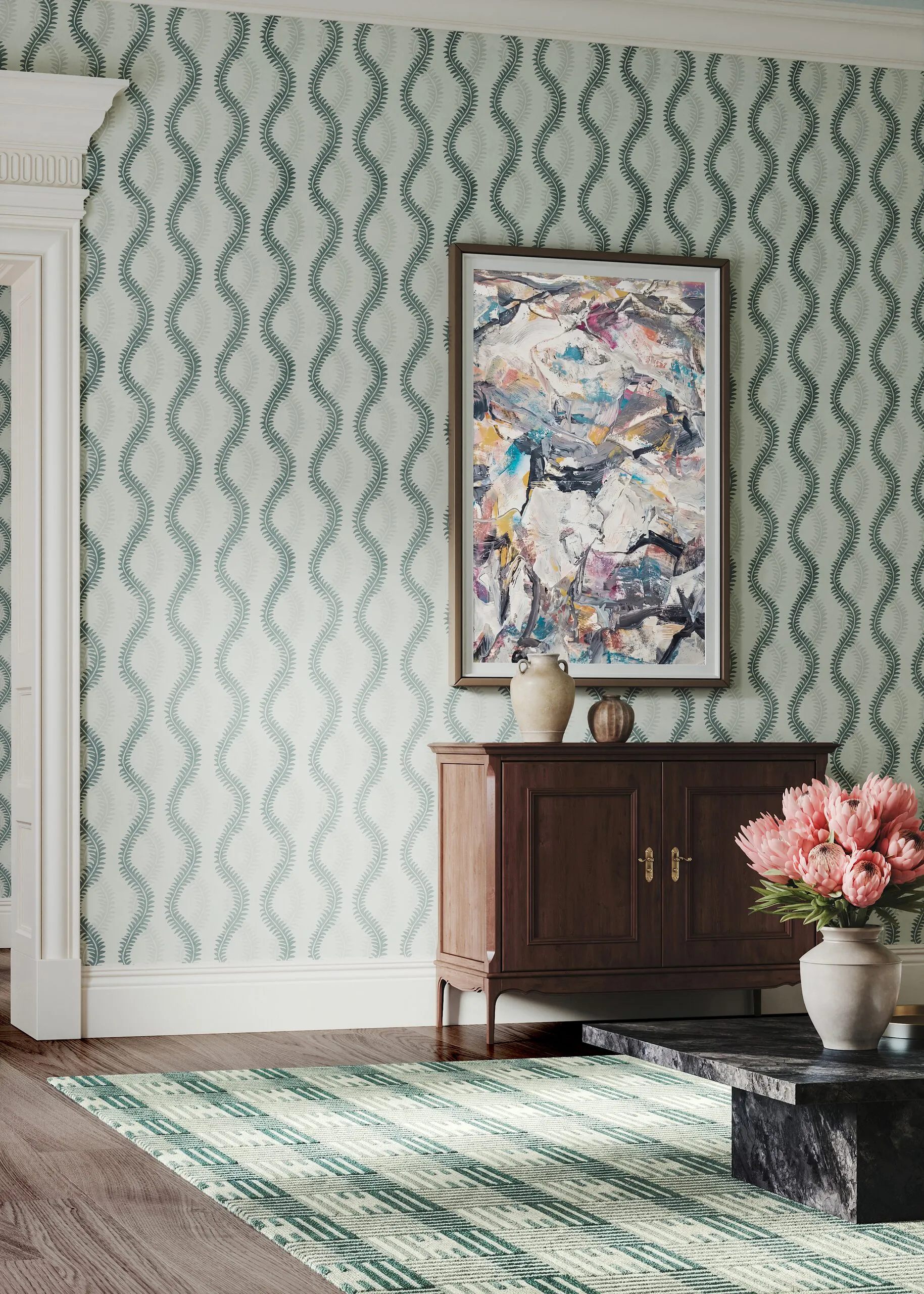
A patterned textile makes a statement. Two patterned textiles in the same room create a clash. Wall coverings and carpets compete for the same visual space in the viewer’s eye, and in photography as well as in visualizations, this clash usually results in visual noise. Perennials, a leading name in luxury performance textiles based in Dallas since 1997, sought precisely this confrontation for its “Hot off the Block” collection. In all four rooms, wall coverings and carpets meet; in the hallway, three wall coverings even meet a runner. The solution lay not in toning things down, but in layering. Scale against scale, contrast against contrast, until a hierarchy emerges that the eye perceives as tranquility. Pattern on pattern only works when one of the two patterns is ready to respond rather than to speak.
One Design, Two Physical Truths
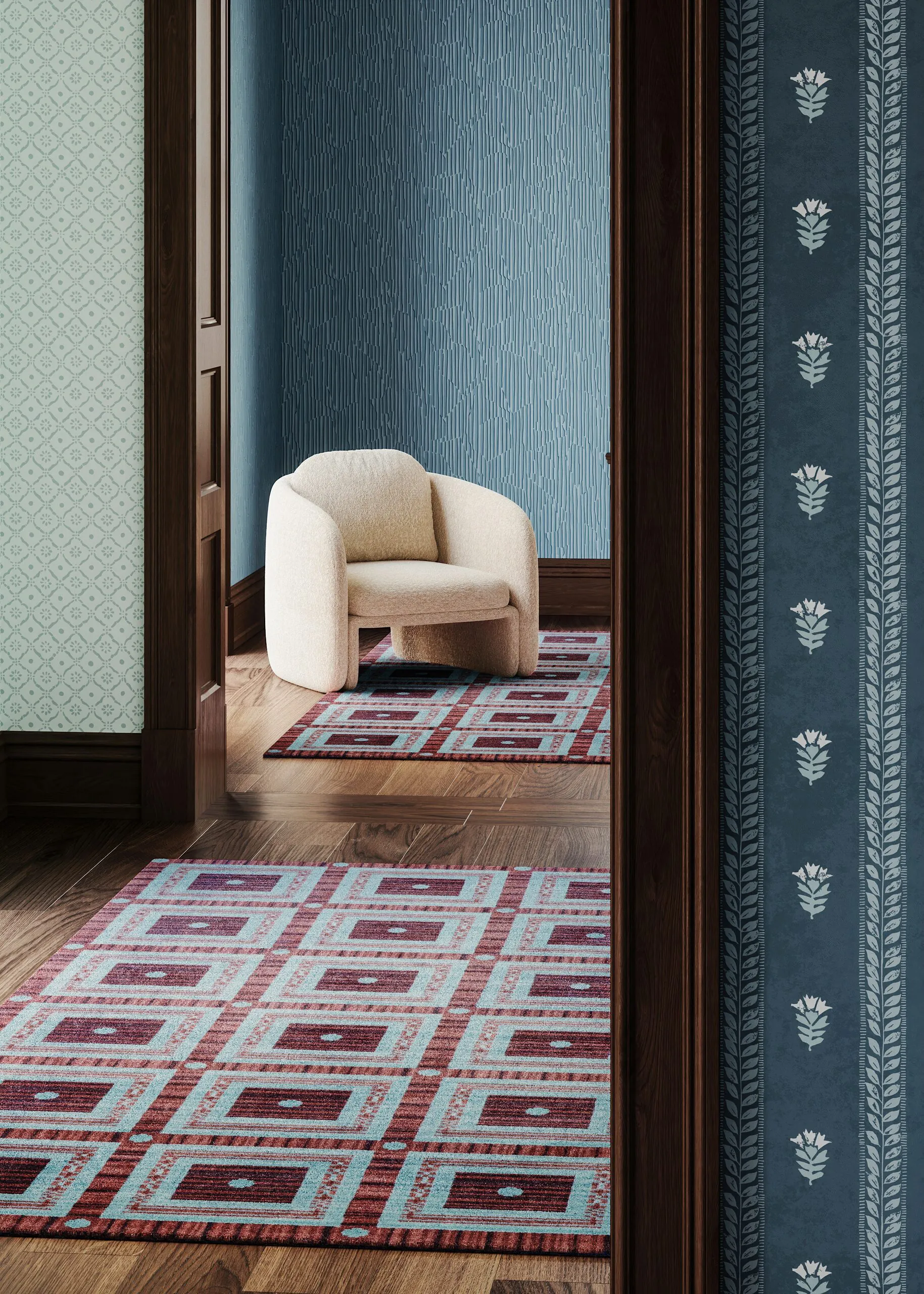
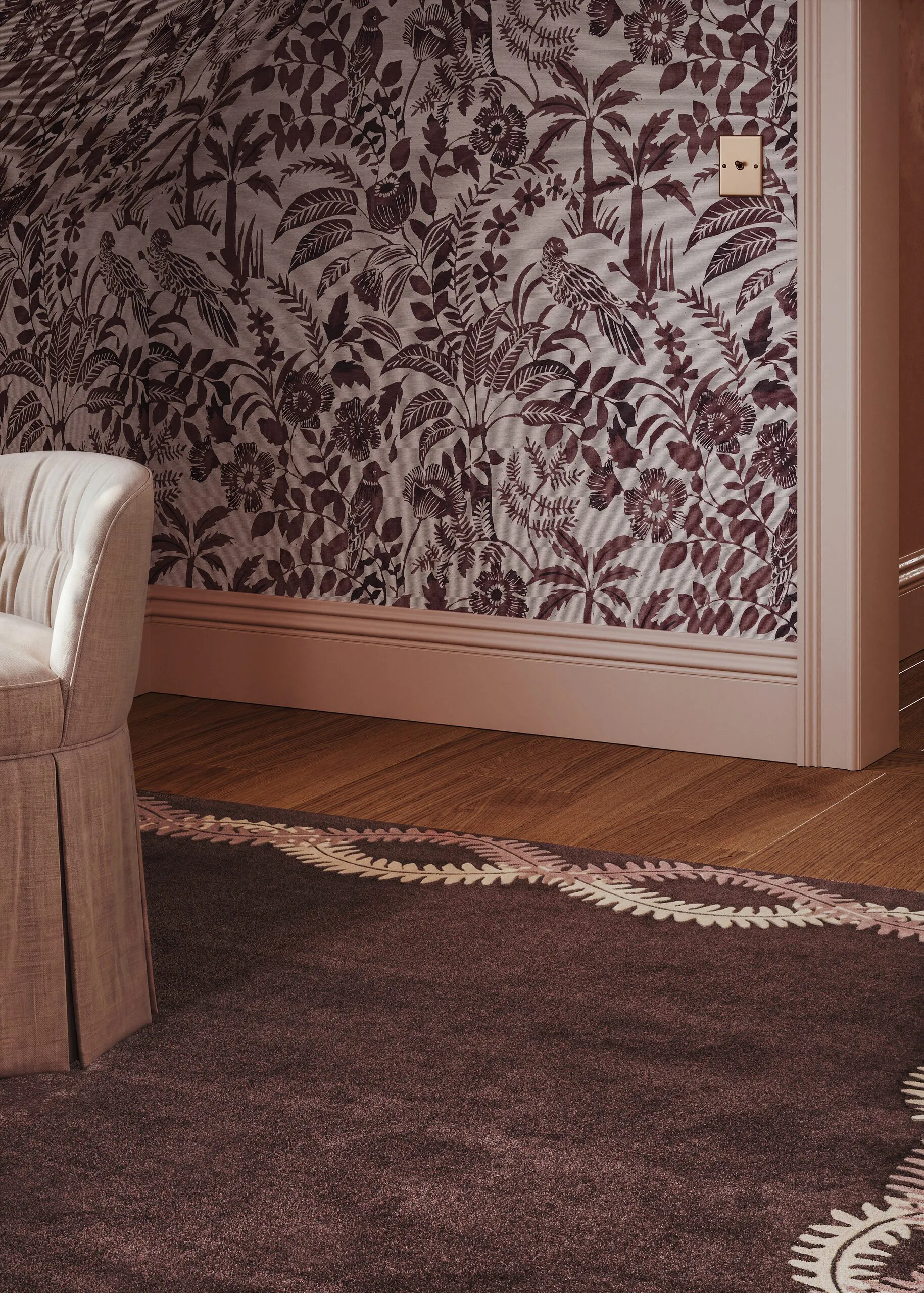
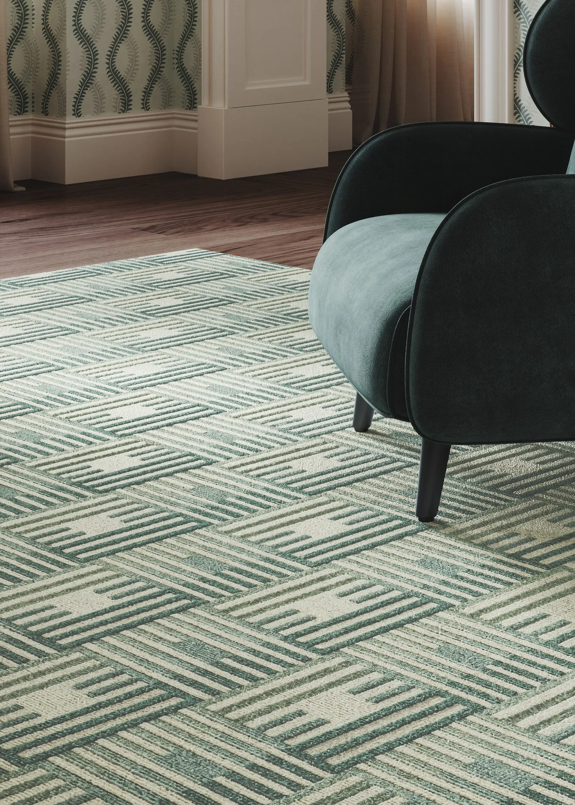
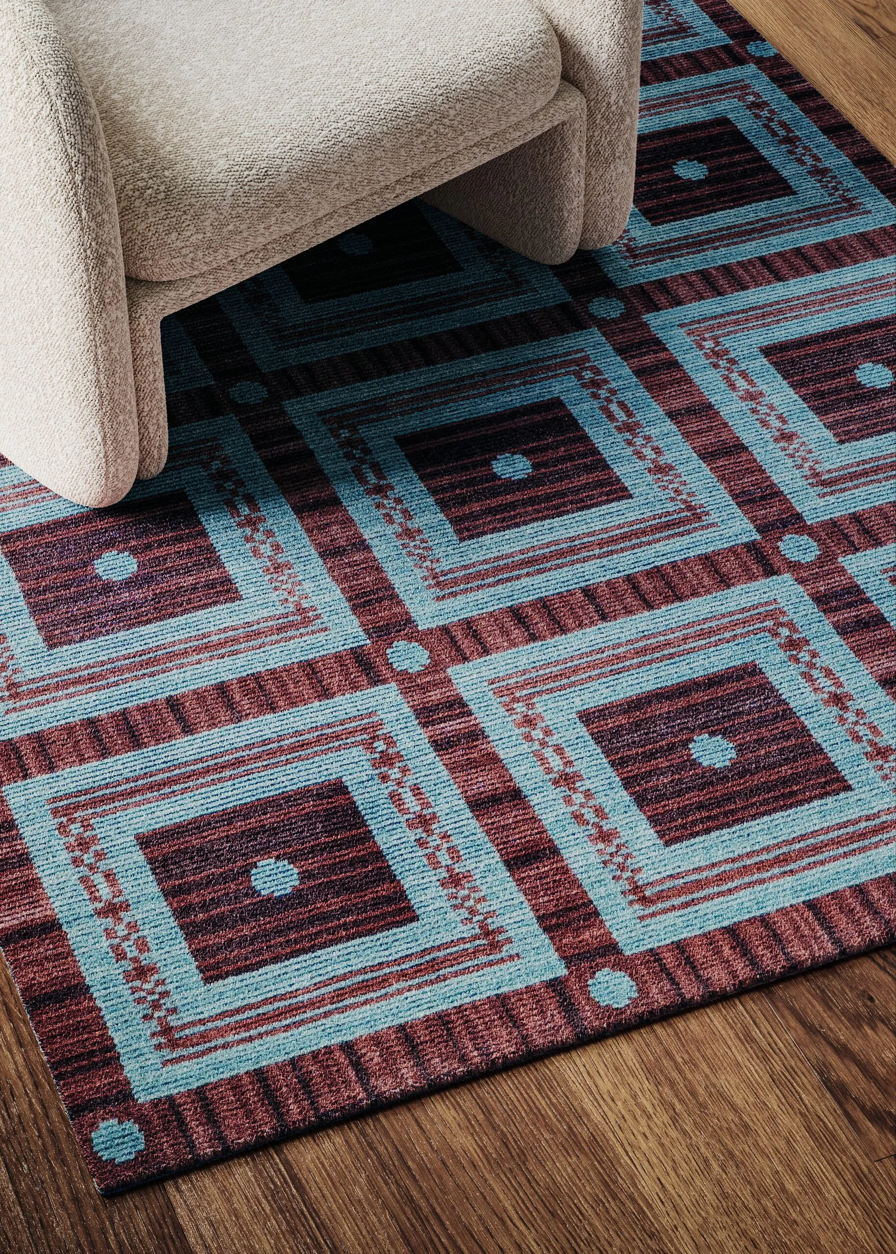
The collection features a challenge that is rarely presented so clearly in 3D visualization. The “Fine Vine” design appears twice: once as a hand-woven rug in Blackberry, and once as a wall covering in Cerulean. Graphically identical, yet physically worlds apart. A wall covering absorbs light flatly and reflects it evenly. A pile refracts the same light in a thousand directions, casts micro-shadows between the loops, and shifts its color depending on the viewing angle. Perennials uses solution-dyed acrylic on the carpet side, so the color is embedded in the fiber rather than on the surface, which further alters the depth. We therefore modeled both materials separately - just as we typically digitize surfaces - until the pile height, fiber direction, and light diffusion were just right. The pattern remains the same. The material tells two truths.
The Pattern Follows the Architecture
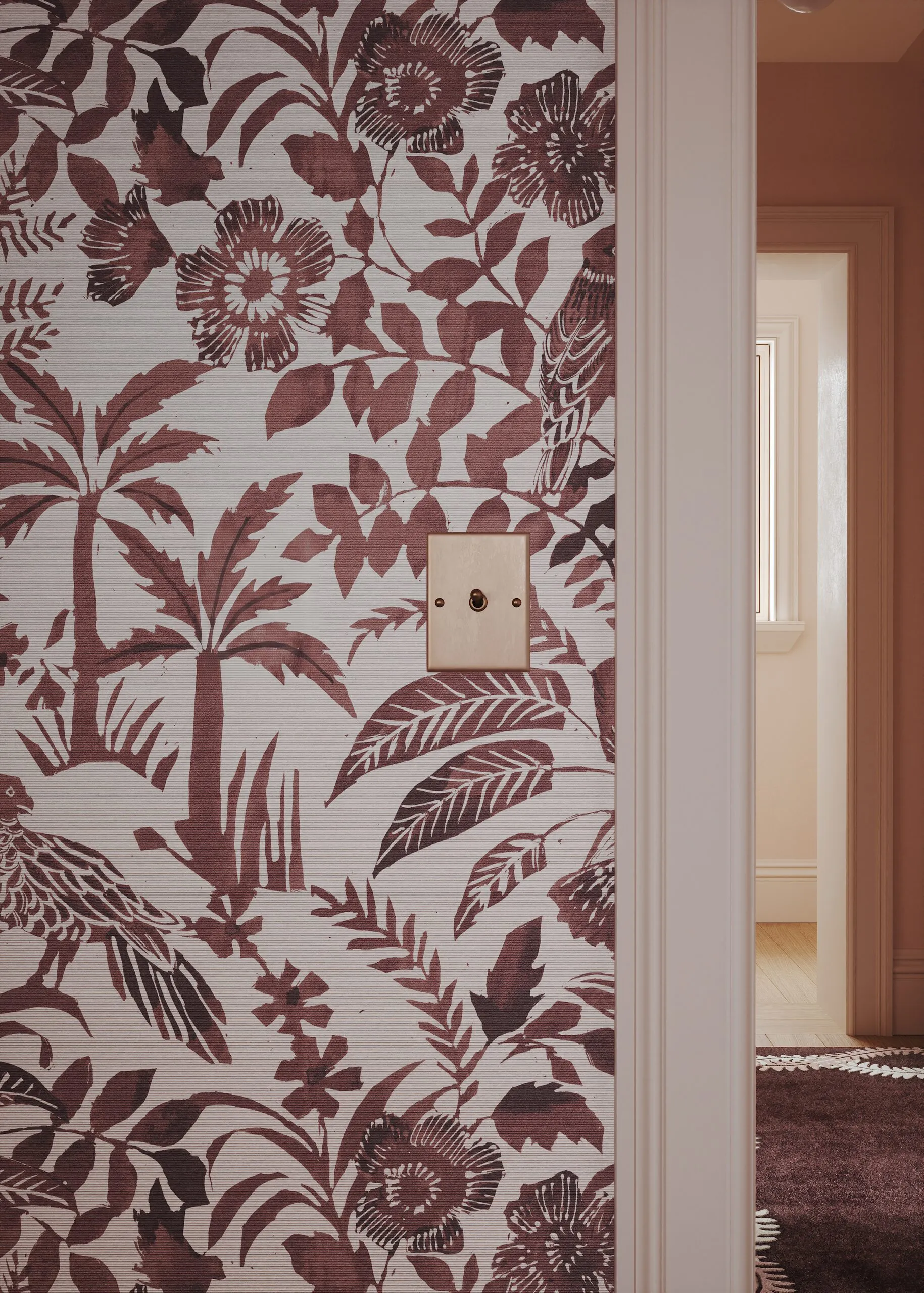
Wall covering on a flat wall is a straightforward task. Things get interesting where architecture begins. The challenge was to apply the covering around cornices, in wall recesses, and across door frames. In the third room, it runs up the sloped ceiling to the ceiling itself. The pattern repeat must flow smoothly across edges without any jumps and maintain its proportions on the slope. This is no longer just texture work; it’s 3D modeling. Each surface was constructed so that the pattern follows the geometry, just as a hand would in real space. For wall covering manufacturers, this is precisely the point at which a visualization succeeds or fails. You only notice this work when it’s missing.
Four Rooms, Designed for a Textile
Before a single rendering could be created, the spaces had to be designed. The briefing didn’t describe backdrops, but rather a design philosophy: curated interiors, timeless surfaces free of historicism, millwork in a color rather than white, and a dark, rich palette. From this, we developed four distinct architectural concepts, ranging from an open living space to a hallway with a visual axis to a room under a sloped ceiling. The furnishings blend antique pieces, mid-century modern silhouettes, and upholstered furniture; metals bear a patina, and nothing looks brand-new. This interior visualization follows a guideline that is rarely formulated so clearly: furniture should be styled realistically, but it should not be the main focus. It is precisely this restraint that draws the eye to the textiles.
The Long Visual Axis and the Soft Light
The brief called for soft, romantic lighting and perspectives that reveal multiple rooms at once—through doorways and along lines of sight. In photography, this means a fully constructed set. In visualization, it means the same thing. Even the space that appears as nothing more than a hand-width-wide glimpse behind a doorframe must exist, be lit, and be rendered. Here, light is not evidence of material quality, but rather a mood. It’s acceptable to leave corners in semi-darkness, because that’s exactly what an inhabited space does. Added to this was the requirement to deliver some of the images in both portrait and landscape orientation. Both formats were planned during the camera setup and were not created by cropping the images afterward. An image that is cropped loses its composition.
The Stage Remains, the Collection Changes
Four rooms gave rise to twelve motifs, some of which were also created in a second aspect ratio. The real value, however, lies in what remains possible afterward. The “Birds of a Feather” design already appears in this series in two colorways - Grass and Blackberry - in two different rooms. Once the space, lighting, and camera are set up, creating another colorway is no longer a project but simply a rendering. For a brand like Perennials and Sutherland, which introduces new collections seasonally, this shifts the economics. The set is built once and lasts for years, while the collection changes within it. Traditional photo production fails precisely here, because each variation requires a new layout, a new setup, and a new day of shooting. The same logic later supports a 3D product configurator as well.