Table of Contents
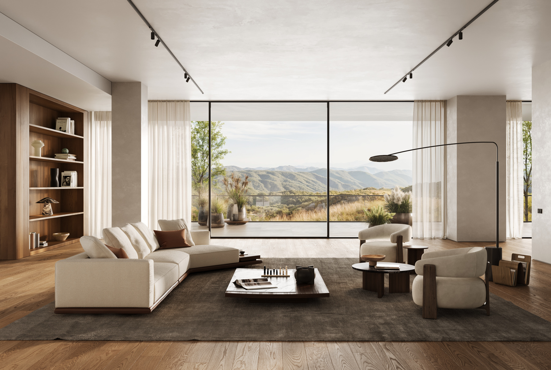
Furniture and home and living brands need images that show their products accurately and belong to their brand. That work starts long before the final rendering: with an understanding of the product, a creative direction and a clear idea of what the images should communicate. At Danthree Studio, furniture craftsmanship, interior design and digital image-making come together in this process.
The process can be divided into three steps. An independent image series created by our studio, featuring living and dining spaces, illustrates individual design decisions. The reference material needed for a specific project depends on the product and the agreed scope of work.
Step 1: Understand the product and the brand
A sofa can be recognized by its silhouette. But its character also lies in the construction of the upholstery, the stitching, and the relationship between the cover and the frame. Before a visual concept can emerge, these characteristics must be understood. Beautiful lighting cannot compensate for incorrect proportions.
Equally important is the brand behind the furniture. What visual language has already been established? What defines the collection, and who is its target audience? Existing campaigns, brand guidelines, and reference images help us understand this direction. In our creative direction, we translate these elements into decisions about atmosphere, the effect of materials, lighting, and perspective. This ensures that the product isn’t just placed in a beautifully designed space: the images align with its brand and intended use.
What you bring as a brand
We start with your product knowledge and the goal of the communication: Which collection is being presented? Who is the target audience? Where will the images be used? Existing CAD or 3D data, technical drawings, dimensions, product photos, and material samples provide different types of information. Not everything needs to be ready just yet. Together, we’ll determine what resources are already available and what else is needed for the planned visuals.
From STEP file to imagery: preparing the model
If you already have a 3D model, we’ll check whether it’s suitable for the planned images: Are the shape and scale correct? Is the model structure clean, and can materials be accurately rendered on the surfaces? This review will determine what adjustments the model needs.
If a suitable model does not yet exist, we’ll build one based on your product documentation. This may involve combining technical drawings, dimensions, and photos from multiple angles. Even cell phone photos can be helpful if they show the necessary details. STEP files from the design process can provide the basic shape. For the photorealistic rendering, we further process this data and align visible details with the reference materials.
The sequence combines a camera pan through the editable 3D scene with a wireframe view, a neutral model view, and the final rendering. The transition illustrates how materials and lighting alter the spatial effect. The views explain the composition of the image; they do not show a time-lapse of the production process.
From material sample to digital image
In the next step, we’ll determine what texture and material data is available. Suitable data will be prepared for the digital material. If this data is missing, you can send us physical samples, which we’ll digitize or scan. Another option is to use suitable materials from our library, provided they accurately reproduce the required surface. A fabric isn’t described solely by its color: its texture, relief, and how it behaves in light all shape its overall effect.
What Danthree contributes
We combine these fundamentals with a visual concept. Our founder, Daniel Schuster, is a master carpenter and designer. His understanding of craftsmanship helps him take a closer look at a piece of furniture: How does an edge run? Where do components meet? How does an upholstery fabric drape over a curve? Together with interior design and 3D modeling, these questions become part of the visual preparation process. You can learn more about this connection in the studio profile.
Your starting materials
Product Data · Material References · Brand Guidelines · Image Usage
Our creative work
Visual Concept · Interior Design · Models and Materials · Lighting and Camera
Reviewing the work together
Finalize the room layout · Select perspectives · Review the finished images
A fabric is more than just its color
The example shows a cream-colored upholstery fabric with an irregular, nubby surface. Lighter yarn and darker gaps give it its texture. Two samples from the supplied texture files show how color and fine surface relief are described separately. For the fabric to look convincing on furniture, the scale of its texture and its response to light also need to be right.
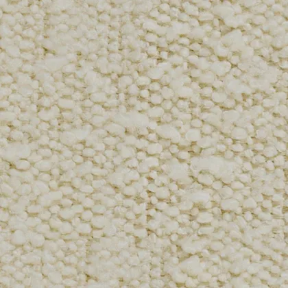 Color and Pattern
The color map shows the cream-colored yarn and the darker gaps between it. It defines how color is distributed across the surface.
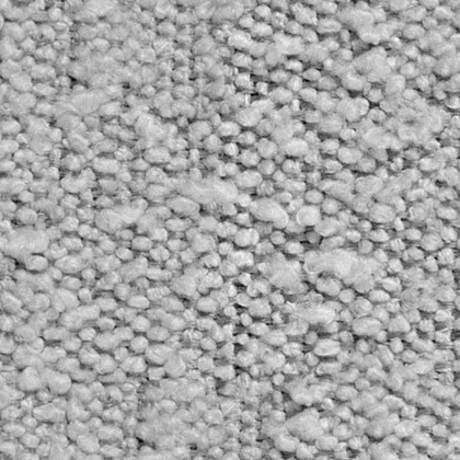 Fine surface texture
The bump map describes fine surface relief through brightness values. It changes the shading so the nubby texture responds to light without changing the model’s geometry.
Enlarged samples of the light upholstery fabric: the color map and its corresponding bump map side by side. How bump mapping works in the Blender manual.
Step 2: Design the space and camera views
Based on mood boards, brand direction, and the target audience, our interior designers develop the space for the 3D scene. The product serves as the starting point; architecture and furnishings provide it with a design context.
A visual world is created through a series of interconnected decisions. Architecture, lighting, and furnishings should provide a fitting setting for the product. This goes beyond simply choosing a wall color: How much space should a piece of furniture be given? What perspective highlights its shape? Should the scene feel calm and open, or cozy and inviting?
In the dining room scene shown here, the line of sight extends across the table and into the living area. Wooden surfaces connect the two rooms. The light-colored tabletop stands out against its base; the upholstered chairs frame it. This arrangement can be seen in the wide shot before a close-up brings the viewer closer to the individual surfaces.
The space provides context for the product: furniture, lighting, and open areas all work together to determine how serene and spacious the visual environment appears.
A model view helps to examine these spatial relationships separately from the detailed material effects. A line represents an edge, and a gray area represents the volume. The final rendering adds surfaces and lighting to both. These representations answer different questions; a line view alone does not prove that the model has been technically verified.
Three views of the same scene: lines make edges visible, the gray model shows volume, and the rendering adds material and lighting.
For a new project, we tailor the visual concept to the brand. The space serves the images the project needs. A wide website hero image calls for a different composition than a close crop for a product page. Both should be considered when planning the camera views.
A curated selection rather than random perspectives
Our artists propose perspectives that specifically showcase the product and the space. From this curated selection, you decide which views to develop further. This way, you determine which images will serve as the foundation for your communication before the final image editing takes place.
Step 3: Refine and deliver the images
Once the images have been selected, they are fully refined. During post-production, we fine-tune the images in detail and ensure they align with the product and material references. Both the individual image and its place within the series are important in this process.
During development, the image concept becomes a representation of the product that can be checked against references. The scale of a fabric texture, the direction of wood grain and the transition between upholstery and base all affect how a piece of furniture is perceived. These details need to match the available product references. When a reference is unclear, asking for clarification is more useful than adding a decorative detail that the product does not have.
The close view reveals the transition between stone veining, wood and fabric. The edge also makes the thickness of the tabletop visible.
Side lighting highlights the fabric's texture and the folds of the cushions. A narrow shadow line separates the upholstery from the wooden base.
The elevated view reveals the shape of the seat and its connection to the side shelf, adding another perspective to the room view.
Material variants need a fixed reference point
To evaluate a different upholstery material, we keep the camera, furniture and lighting as consistent as possible. This makes the effect of the new material visible. When both fabric and color change, the images show different material options rather than an isolated color comparison. We therefore identify each option together with its material references.
Color rendering is also part of the calibration process. The digital material, lighting, and on-screen display all work together. The Blender manual on color management explains the technical background behind this process. For more information on our work with surfaces, see Material Digitization.
The work behind the image remains visible
The human contribution lies in these decisions and in controlling them. An editable 3D scene allows separate access to the product, the space, and the camera. A perspective can be changed while retaining the same model. A covering can be replaced without having to redesign the furniture. Nevertheless, whether the representation is accurate must be assessed based on the product data and references.
A single AI-generated mood image does not establish accurate dimensions or consistency of every product detail across a series. AI can support individual tasks. The team remains responsible for product representation, design and approval. What matters is which properties can be verified and which changes can be made deliberately.
Sharing product knowledge: the team reviews views and material samples. A general glimpse of studio work, separate from the image series shown here.
A coherent result
Finally, the images are viewed as a series. Do the texture and lighting remain consistent across the different views? Is the product clearly visible in the intended crop? Do the room views and details complement each other? A visual language gains its cohesion from such harmonization. It should present the collection in a way that is easy to understand and remain recognizable across different image areas.
You will receive the finished images as TIFF files for further editing. The specific images and output formats required will be determined based on your project.
The image series “Furniture in Focus” shows how wide views and material details work together. Our article on corporate identity in CGI visualization explores the design principles behind this approach.